i-payout
Spearheaded the design and launch of a student wallet product from 0 at i-payout, built to support international students in Canada with tuition payments, daily living expenses, and financial onboarding. Designed the full product strategy, UX flows, and go-to-market plan—ensuring the app was optimized for usability, compliance, and multilingual accessibility.
UX
Product Design
SaaS
UI

Project Overview
Client: i-payout, a global fintech company expanding into Canada
Industry: Fintech / SaaS
Timeline: 12 months (2024 - 2025)
My Role: Product Marketing Specialist, UX Research & Product Design
Problem
International students face challenges managing tuition and daily expenses across borders. Existing solutions were fragmented, with high fees, slow processing times, and limited integration with local payment systems.
Problem
International students face significant challenges managing tuition and daily expenses across borders. Current solutions are fragmented, with high transfer fees, long processing times, and limited integration with local payment systems. These issues create financial stress for students and parents, while also limiting universities’ ability to streamline tuition collection.
Process
Research & Discovery
Conducted market analysis on 1M+ international students in Canada.
Interviewed students to uncover pain points in tuition payments and remittances.
Benchmarked existing wallets (Alipay, GCash, Kakao Pay).
Design & UX
Created user journey maps for onboarding, KYC, tuition payment, and daily spending.
Built low-fidelity wireframes in Figma.
Designed a mobile-first experience with clear navigation for students and parents.
Product Marketing
Developed the go-to-market plan targeting Chinese, South Korean, and Filipino students.
Crafted messaging highlighting low-cost cross-border payments and real-time expense tracking.
Collaborated with engineering to align UI design with technical feasibility.
Outcome
Delivered a complete product design package (UX flows, wireframes, low-fidelity UI).
Created low-fidelity wireframes in Figma to explore layouts and user flows, and collaborated with the UX/UI team to transition designs into high-fidelity mockups.
Produced a 3-month GTM roadmap including acquisition channels and partnership strategy.
Positioned i-payout as a competitive fintech player in Canada’s $9B international student market.
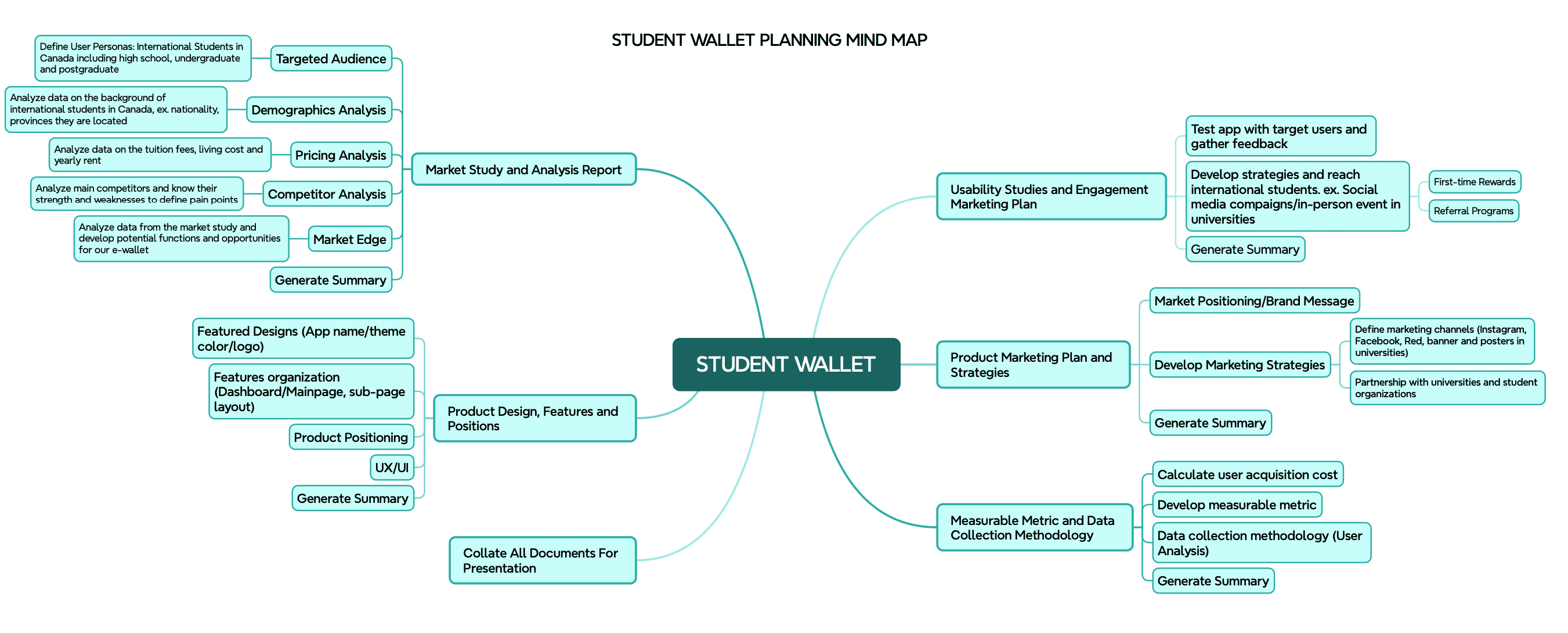
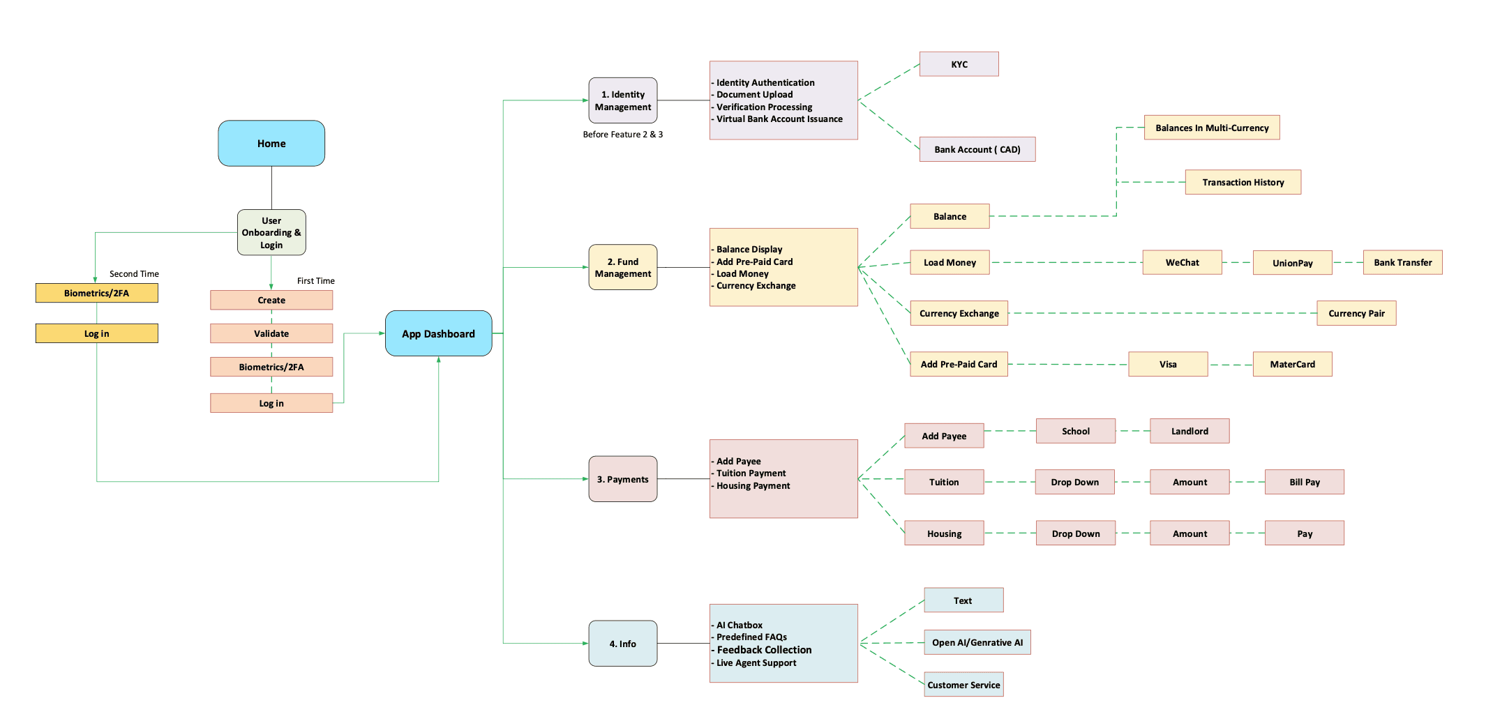
Project Mindmap :
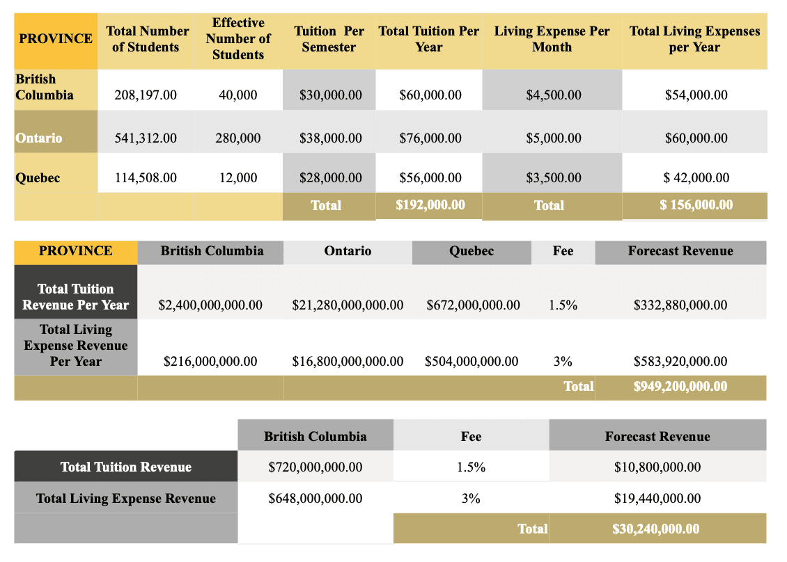
Market Size and Potential Revenue:
Work Sample — Market Size & Revenue Forecast (excerpt only). This analysis calculated tuition and living expense revenue across provinces, but due to confidentiality, only select tables are shown.
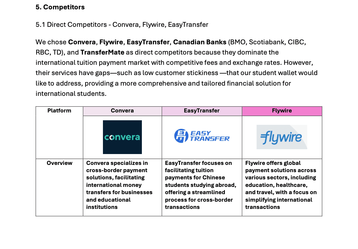
Competitor Analysis :
Work Sample — Competitor Analysis Section (excerpt only). The complete report contains sensitive financial and market information, so only select pages are shared here.
User Research
As an international student myself, I started by speaking with people in my immediate community, classmates and peers who were also navigating tuition payments and cross-border living expenses. This gave me first-hand insights into the frustrations students face when managing finances abroad.
To expand beyond my circle, I:
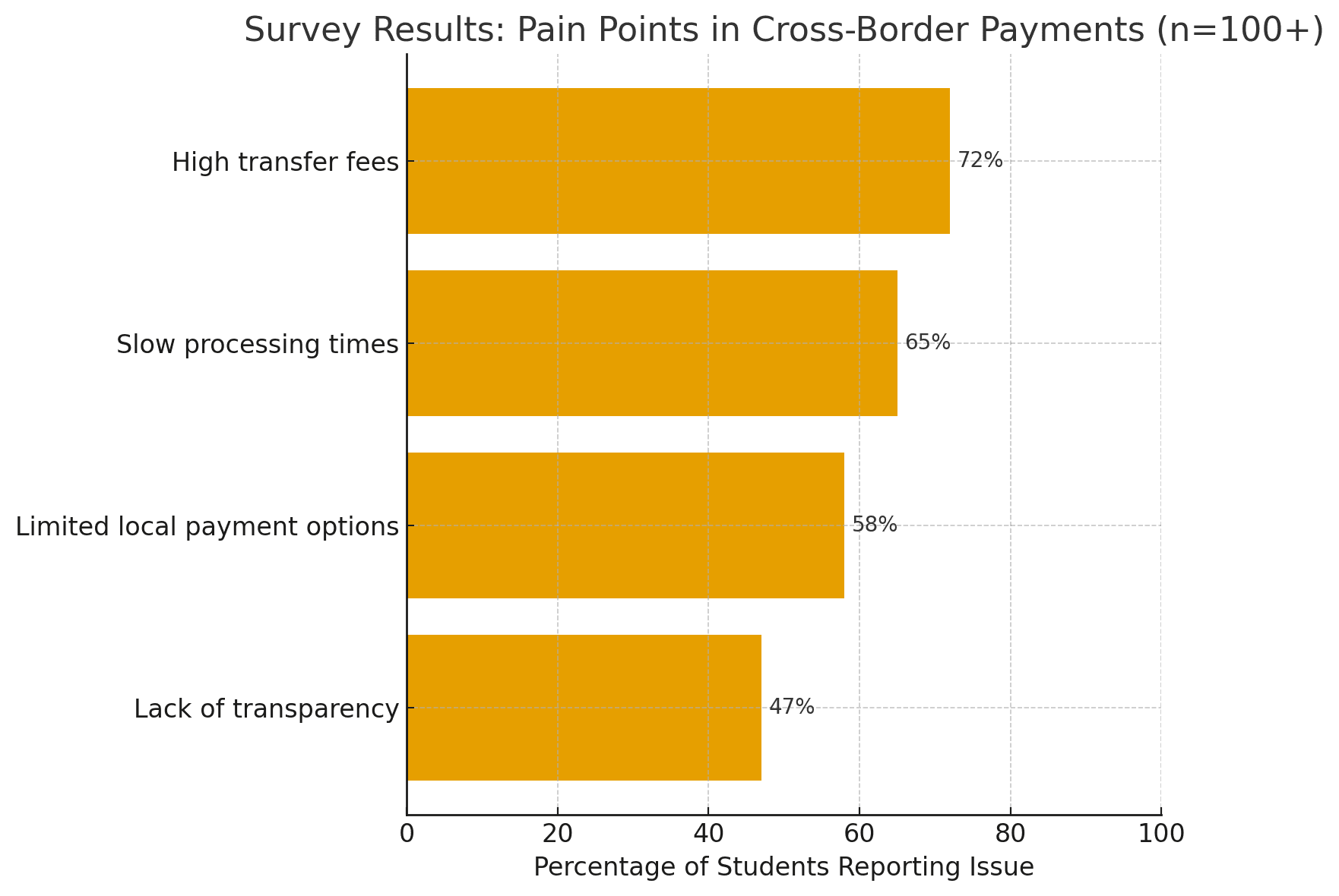
Conducted 15+ interviews with students from China, South Korea, and the Philippines to uncover pain points in tuition payments, remittances, and daily spending.
Launched a survey (100+ responses) via Google Forms, distributed through WeChat, WhatsApp, and student community groups at UBC and SFU.
(See chart below for survey highlights)
Benchmarked existing solutions (Alipay, GCash, Kakao Pay, Western Union) to compare user experience, trust factors, and cost transparency.
Gathered stakeholder insights from university administrators on the challenges of reconciling payments and reducing manual processes.
Key Insights
Students demanded clear fee structures and instant confirmation of payments.
Parents prioritized safety and trust when sending large sums overseas.
Universities wanted a system that could integrate smoothly with tuition collection workflows.
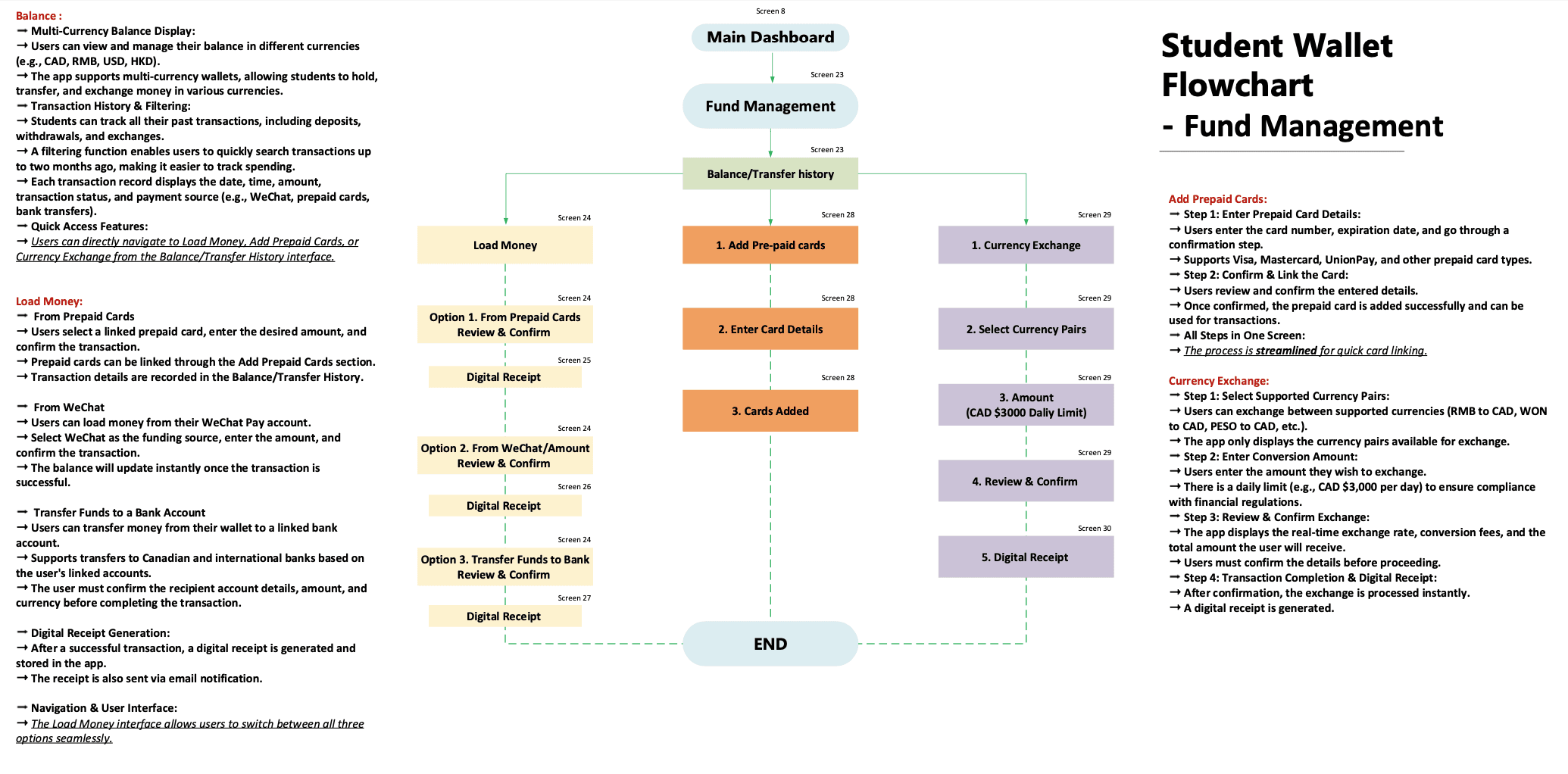
UX Flow :
Work Sample — UX Flow Diagram (excerpt only). This flow illustrates the key steps in user onboarding, KYC, and fund management. The complete flow is confidential and cannot be shared in full.
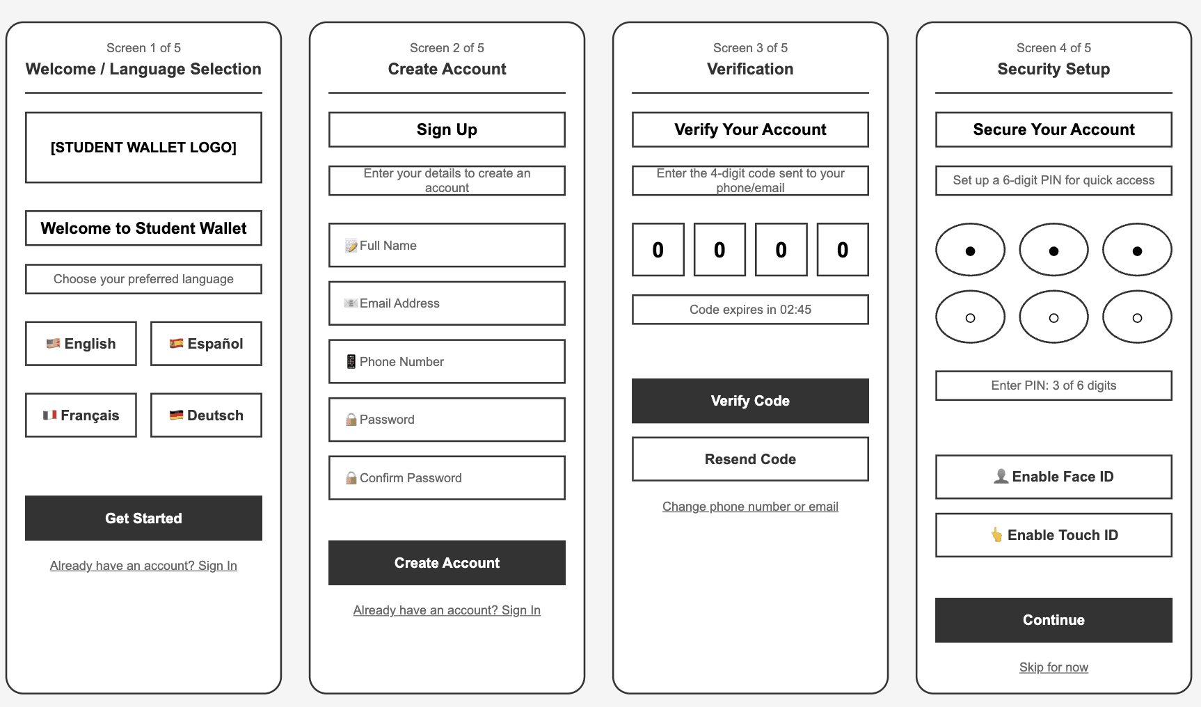
Low-fidelity wireframe :
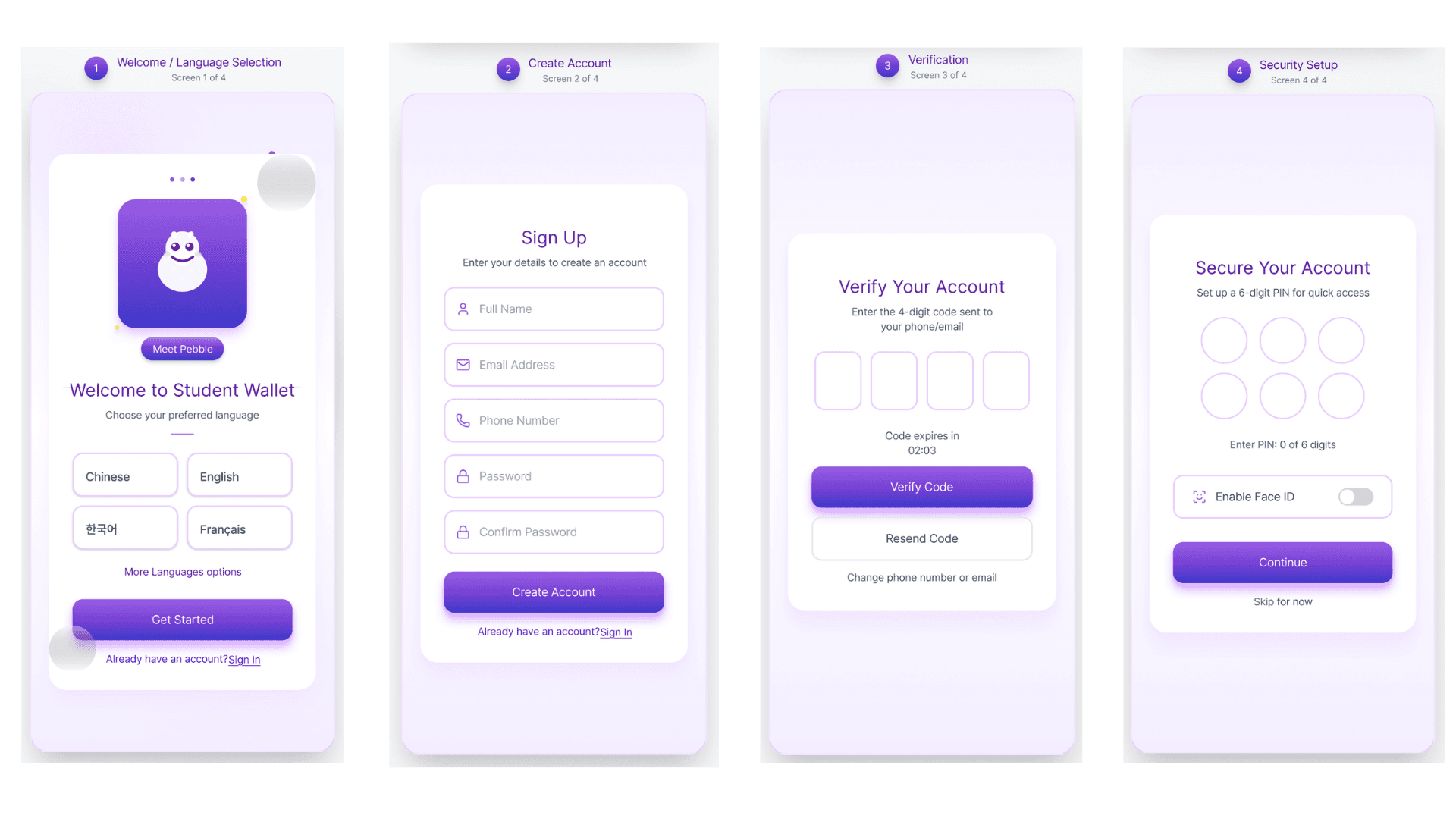
At the early stage of i-payout’s Student Wallet project, I created low-fidelity wireframes using Figma and Miro to explore different layout and flow options. These wireframes helped align the team on structure, user journey, and information hierarchy before moving into high-fidelity design.
Design Rationale
Goals
Map out the end-to-end user journey for onboarding, verification, and payments in a cross-border student wallet.
Explore multiple layout and flow options early, to align the team before investing in high-fidelity design.
Information Hierarchy
Started with a language selection screen to support international users with different language preferences.
Followed by a step-by-step onboarding flow (Sign Up → Verify Account → Security Setup → Success), ensuring clarity and reducing cognitive load.
For the homepage and payment flows, emphasized balance visibility, payee management, and transaction confirmation as the most critical user needs.
Design Choices
Step-by-step sign-up flow: Broke onboarding into smaller screens (5 steps) to make the process feel manageable.
Verification & Security setup: Added both PIN and biometric options (Face ID/Touch ID) to balance security with convenience.
Payment flows: Designed add payee + confirm screens to reduce errors and give users confidence when sending large tuition payments.
Modular structure: Each screen focused on one action, simplifying usability testing and iteration.
Interaction Considerations
Used progress indicators (1 of 5, 2 of 5, etc.) to orient users during onboarding.
Included fallback options like resend code / change number in verification to address real-world user issues.
Built error prevention into the flow by confirming details (e.g., payee info, transaction summary) before final submission.
Future Iterations
Expand language support beyond the initial 5 languages as adoption grows.
Conduct usability testing with students to refine the number of steps and clarity of instructions.
Transition into high-fidelity prototypes with consistent branding, UI patterns, and accessibility in mind.
Work Example 1 (Login / Sign-up Flow wireframe) :
Work Example 2 (Homepage / Dashboard & Payment flow wireframe) :
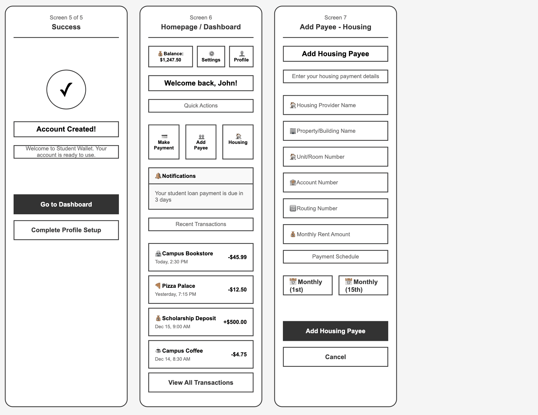
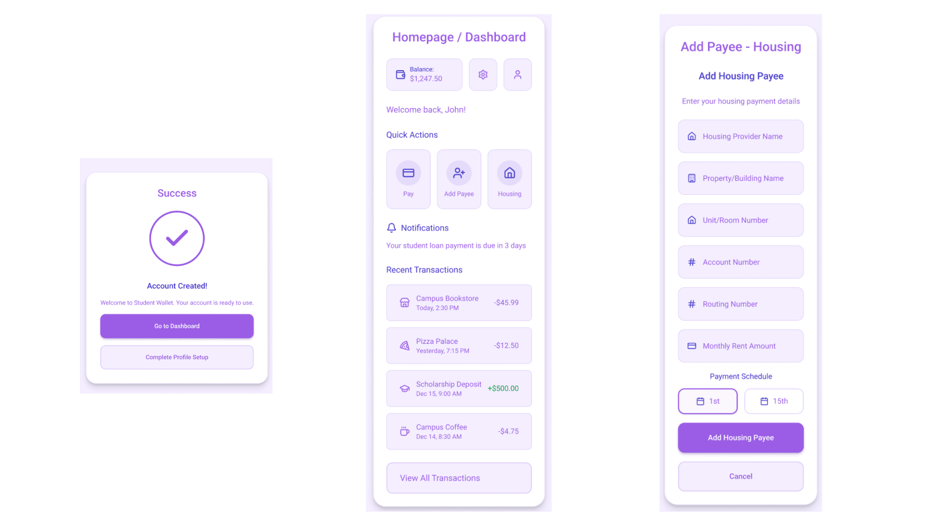
High-fidelity wireframe :
Later, I redesigned the Student Wallet low-fidelity wireframes into high-fidelity prototypes (2025) for portfolio purposes.
I upgraded the flows using Figma and UI component libraries, applying modern fintech UI design patterns. The goal was to demonstrate clarity, trust, and usability for international students managing tuition and living payments.
Design Rationale
Goals
Transform the low-fidelity flows into polished, user-friendly prototypes that reflect modern fintech design patterns.
Build a sense of trust and simplicity for international students managing tuition, rent, and daily living payments.
Information Hierarchy
Onboarding (Login/Sign-up Flow): Clear step-by-step journey (Language → Account Creation → Verification → Security Setup) to reduce drop-offs and build trust from the start.
Homepage/Dashboard: Placed balance and recent transactions at the top to reassure users about their financial status. Quick actions (Pay, Add Payee, Housing) provide fast access to core tasks.
Payment Flows: Structured forms for adding payees and confirming payments to minimize user errors and stress when sending large tuition amounts.
Design Enhancements
Applied a consistent fintech UI system using Figma component libraries for buttons, forms, and input fields.
Used color coding (purple for actions) to provide instant feedback.
Added visual cues like progress indicators, confirmation screens, and success states to reinforce confidence at key moments.
Introduced rounded card components to separate content and reduce cognitive load.
Interaction Choices
Integrated biometric login options (Face ID, Touch ID) for both convenience and security.
Clear confirmation screens for account creation and payments to prevent accidental errors.
Notifications in the dashboard remind students of upcoming bills (e.g., rent, tuition) to improve financial management.
Future Iterations
Conduct usability testing with students to validate the clarity of payment forms and dashboard navigation.
Add data visualization (graphs of monthly spending, tuition breakdowns) for better financial planning.
Expand personalization (multi-language support, customizable dashboard widgets).
Work Example 1 (Login / Sign-up Flow wireframe) :
Work Example 2 (Homepage / Dashboard & Payment flow wireframe) :