TapFish Payments
Led the end-to-end product design of TapFish’s backend payment platform—a stablecoin-based clearing system enabling cross-border transactions between North America and Southeast Asia.
SaaS
UX
AI
Product Design

Project Overview
Client: Tapfish Payments, a pre-seed fintech startup
Industry: SaaS / Fintech
Timeline: 5 months (2025)
My Role: Lead Product Designer
Problem
Travelers often face high FX fees, inconsistent acceptance of foreign cards, and slow settlement for merchants. Traditional PSPs lacked transparency and speed for microtransactions.
Process
1. Discovery & Research
Conducted a business trip to Singapore with the founder to study the local payment ecosystem and experience real traveler pain points firsthand.
Interviewed merchants in Singapore & Canada to map pain points across both developed and emerging markets.
Analyzed competitor PSPs and e-wallets (Debia, Alipay, Kakao Pay).
Identified gaps in FX transparency, cross-border settlement speed, and merchant acceptance.
2. Product & UX Design
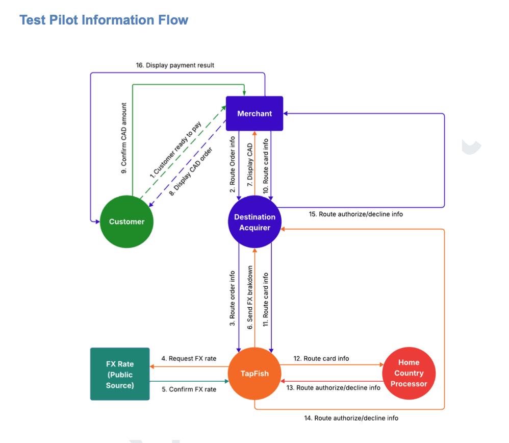
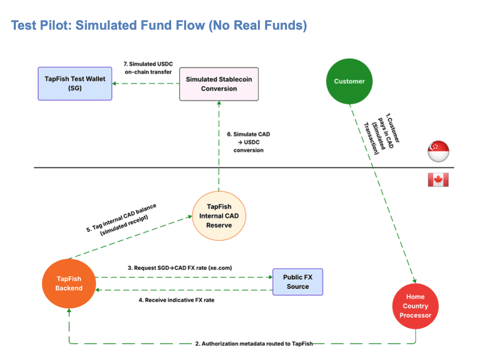
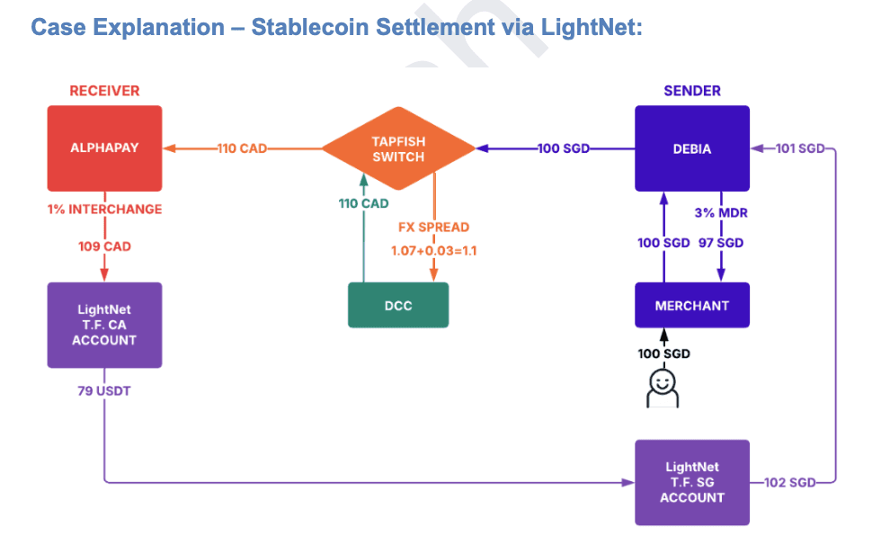
Designed transaction flows: card payment → FX lock → stablecoin clearing → merchant payout.
Created wireframes & prototypes for merchant dashboards (transaction history, payout schedule).
Developed admin flows for KYC/AML checks and compliance.
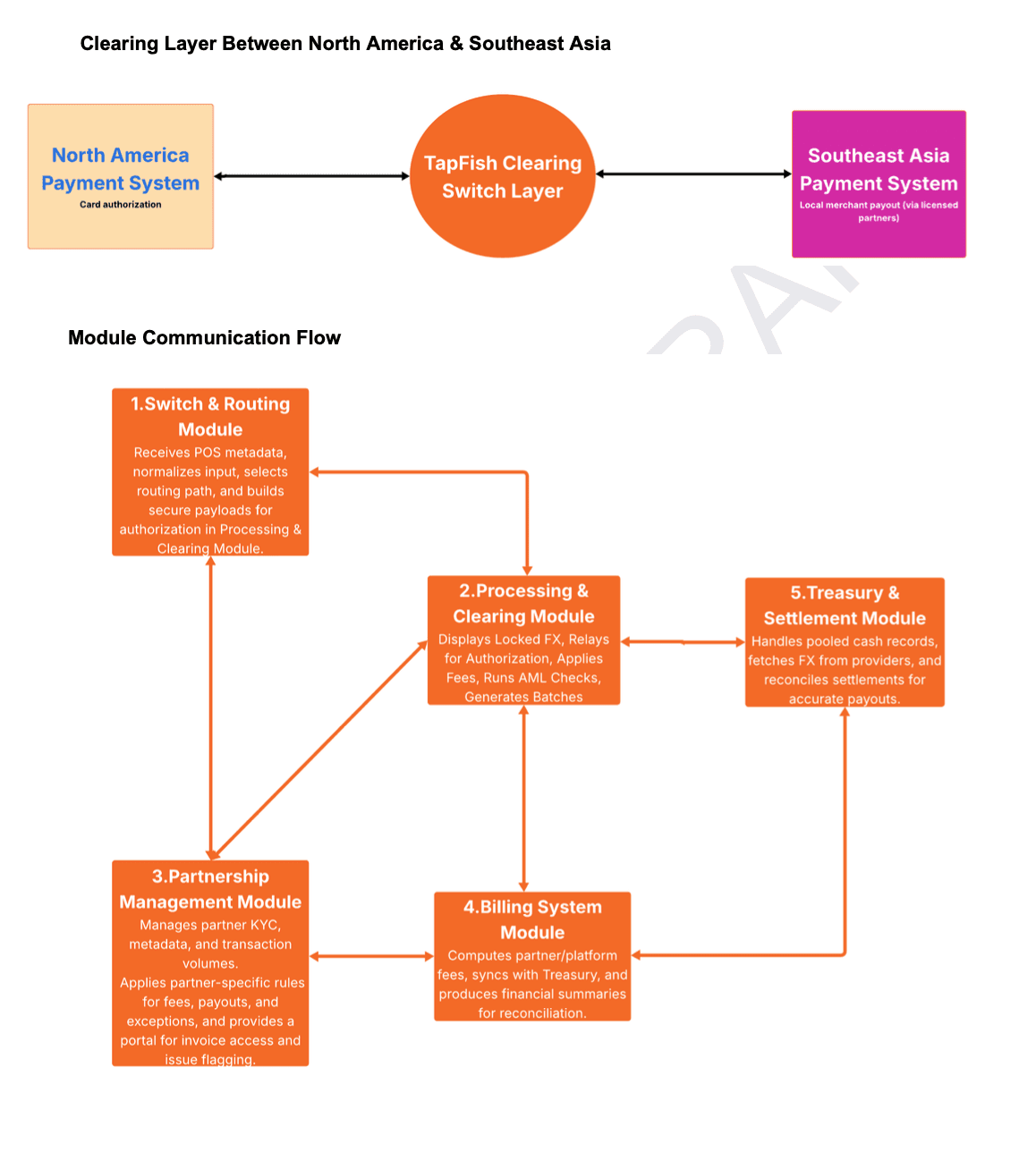
3. System & Backend Design (Black-Box Modular Method)
Applied a black-box modular approach to design the backend system.
Defined modules (Processing, Clearing, Settlement, Compliance) with independent logic and clear inputs/outputs.
Documented each module’s function, triggers, and data exchange rules for seamless integration.
Aligned backend logic with frontend UX to ensure consistent user experience.
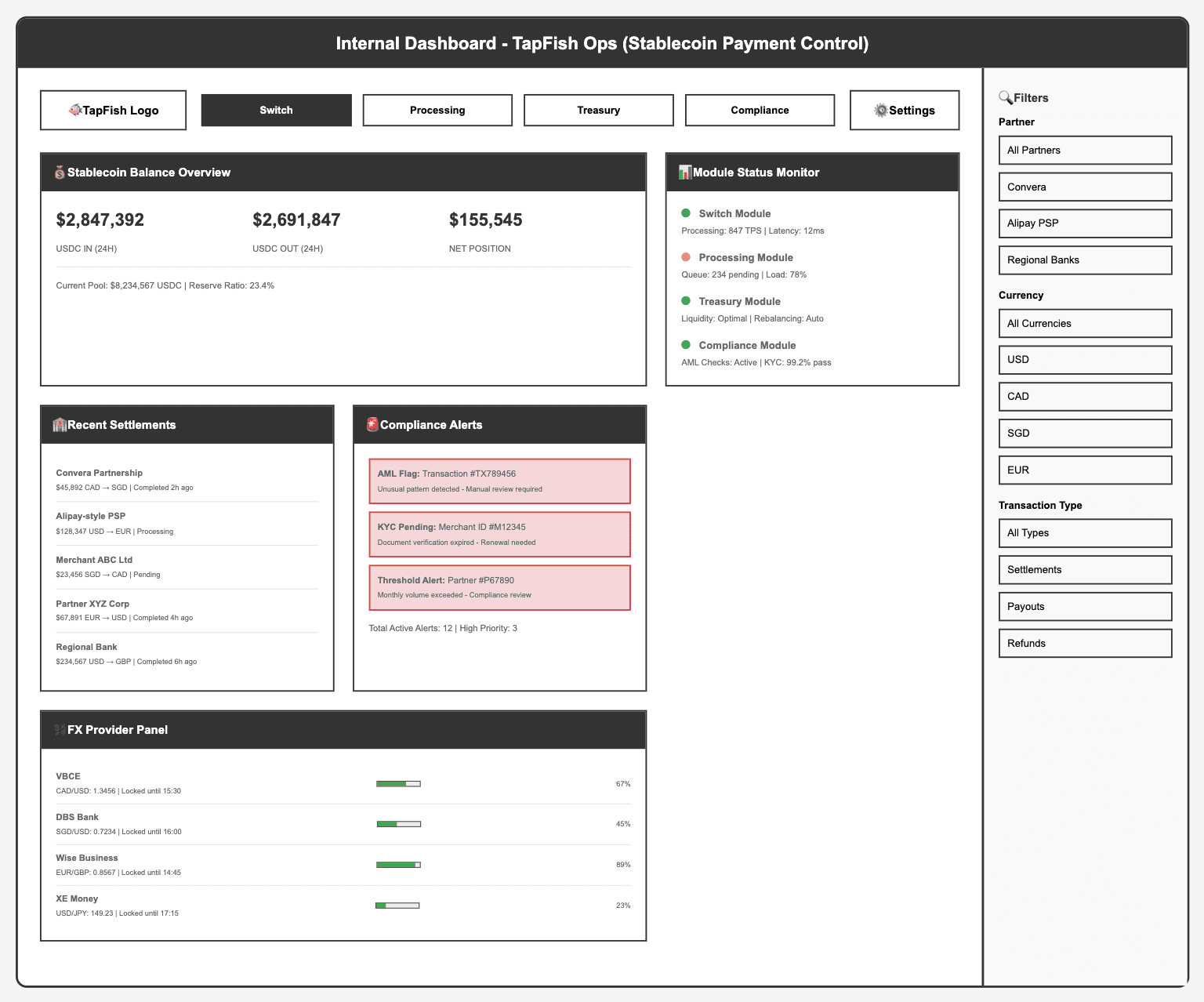
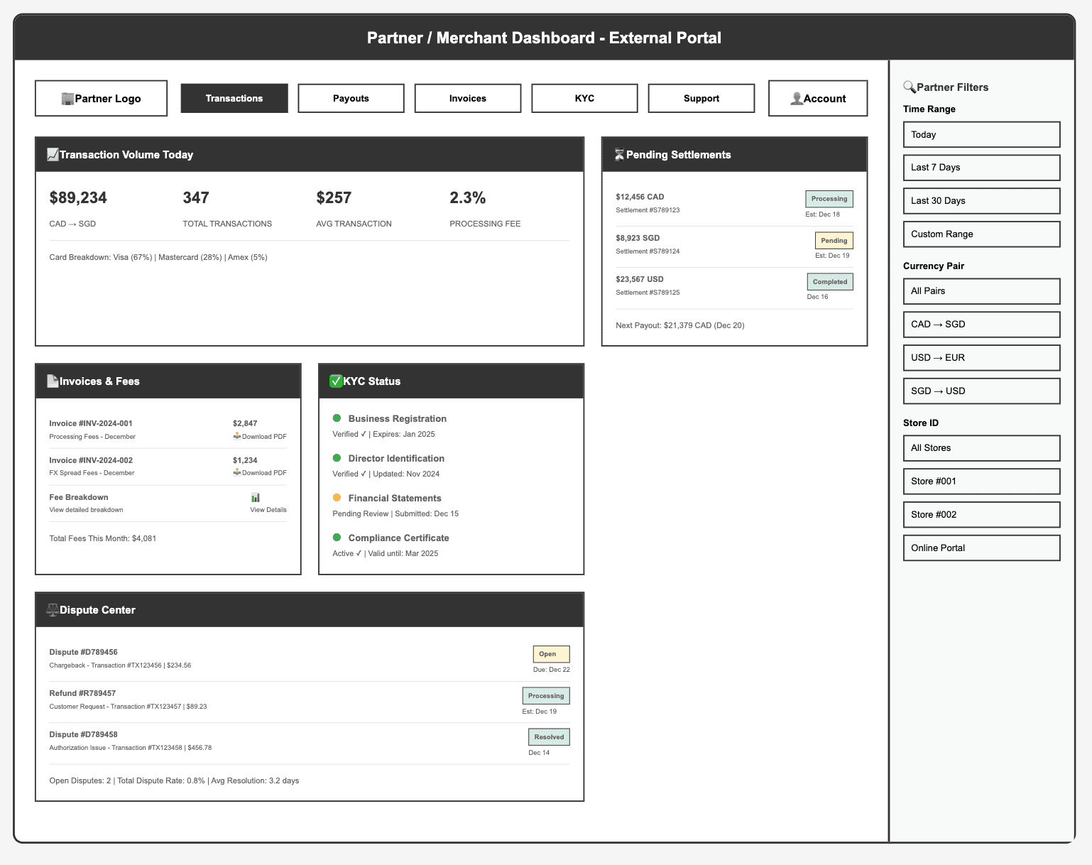
4. Dashboard Design
Created low-fidelity wireframes for both internal (TapFish operations) and external (partners/merchants) dashboards.
Internal dashboard: focused on stablecoin settlements, compliance alerts, and backend monitoring.
Partner dashboard: focused on transaction tracking, settlement visibility, and invoice management.
Ensured dashboards supported both operational needs and partner transparency.
Outcome
Delivered MVP prototype used for investor pitches and partner demos.
Created a design system that reduced dev handoff time by 30%.
Enabled TapFish to position as a tech-driven PSP alternative with stablecoin settlement.
Backend Logic
Due to confidentiality, I cannot share the full backend architecture. However, the diagram below illustrates part of my design logic, showing how I applied a black-box modular method to define the flow of information between modules (Processing, Clearing, Settlement, Compliance).
Work Example 1 :
Work Example 2 :
Work Example 3 :
Work Example 4 :
Low-fidelity wireframe :
As part of TapFish’s backend system design, I created dashboard wireframes using Figma and Lucidchart to illustrate how both internal teams and external partners/merchants would interact with our system.
I produced low-fidelity dashboards and payment flow wireframes in Figma to align engineering, product, and compliance teams.
Design Rationale
Goals
The dashboards were designed to solve two main needs:
For internal teams (TapFish Ops) → provide real-time visibility into stablecoin settlements, compliance alerts, and system health monitoring.
For external partners/merchants → ensure transparency in transactions, settlements, and compliance status, while simplifying access to invoices and financial reporting.
Information Hierarchy
Ops Dashboard prioritized critical modules such as balance overview, compliance alerts, and recent settlements at the top level for immediate action.
Merchant Dashboard placed transaction volume, settlements, invoices, and KYC status front and center to align with merchants’ top concerns: revenue tracking and compliance visibility.
Design Trade-offs
Started with low-fidelity wireframes to enable faster iteration and alignment with engineering and compliance teams.
Chose a two-column layout with primary data modules on the left and filters on the right to balance information density with ease of navigation.
Interaction Choices
Highlighted compliance alerts in red for quick attention by risk teams.
Added downloadable invoices (PDF) for merchants to streamline financial reconciliation.
Included a dynamic filter panel (time range, currency pairs, transaction type) to allow users to quickly adjust views without leaving the dashboard.
Future Iterations
Transitioned low-fidelity wireframes into high-fidelity prototypes, incorporating visual design and brand consistency.
Planned to add data visualization elements (charts, trend lines, heatmaps) to support faster decision-making and proactive monitoring.
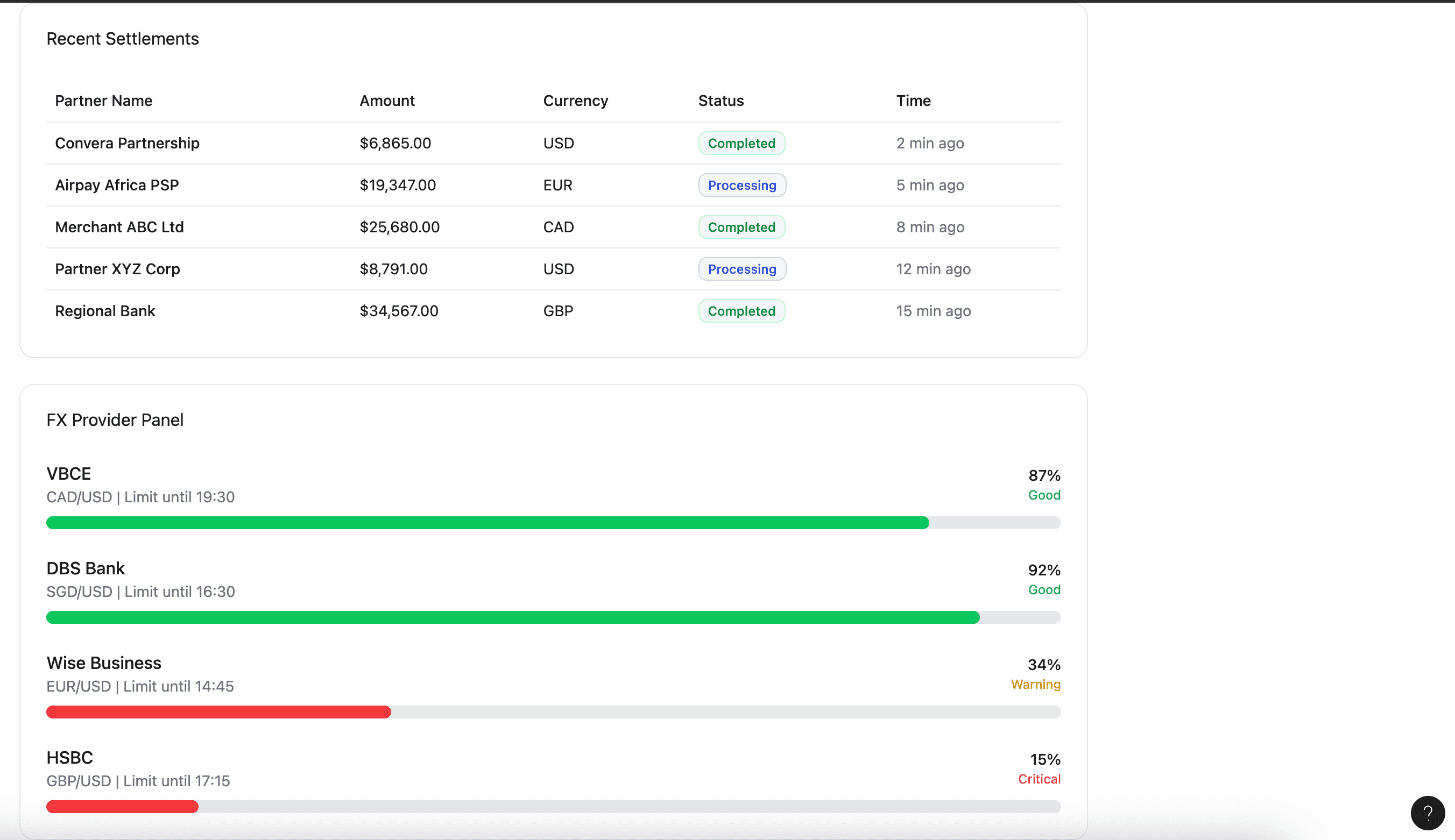
Work Example 1 : Internal Dashboard (TapFish Ops)
Designed for monitoring stablecoin settlements, managing compliance alerts, and viewing real-time module health across processing, clearing, and settlement layers.
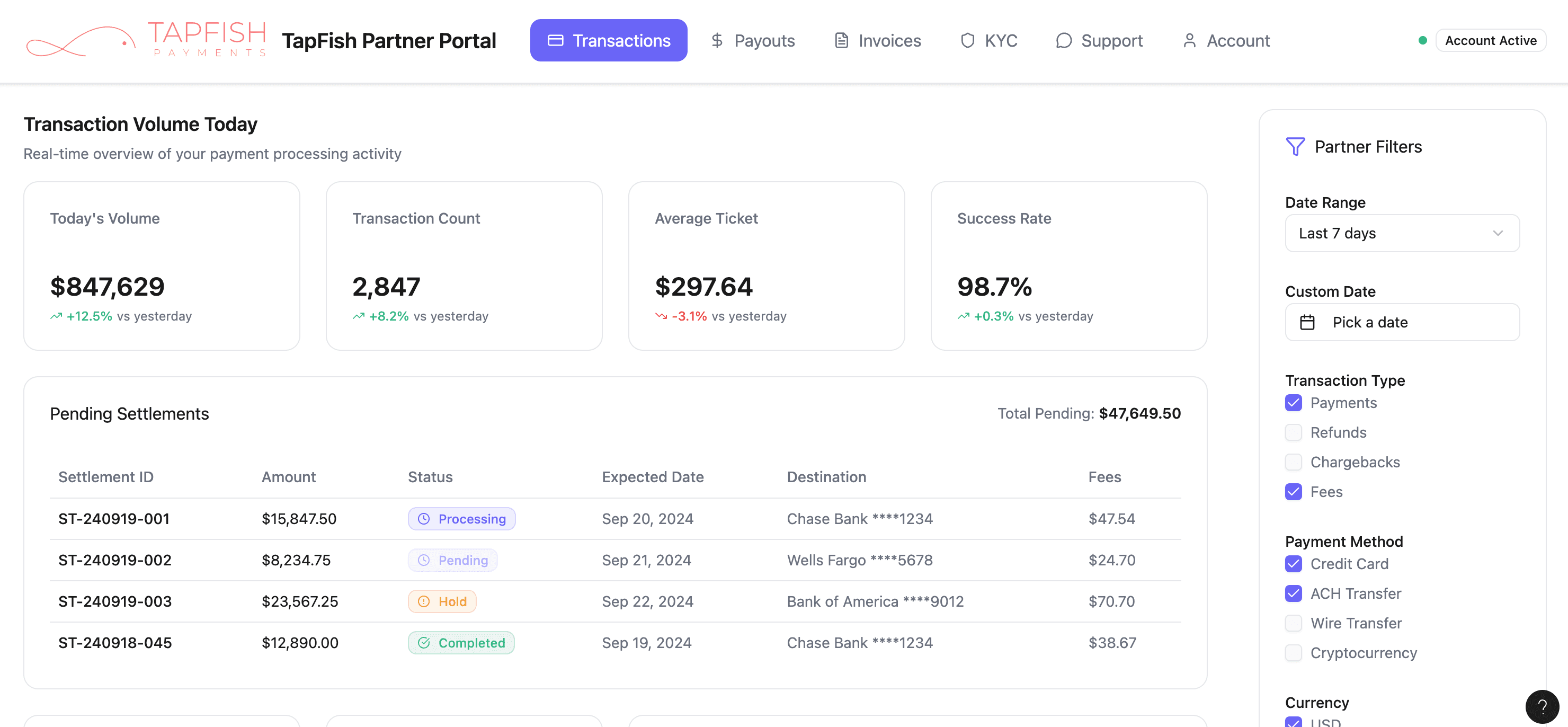
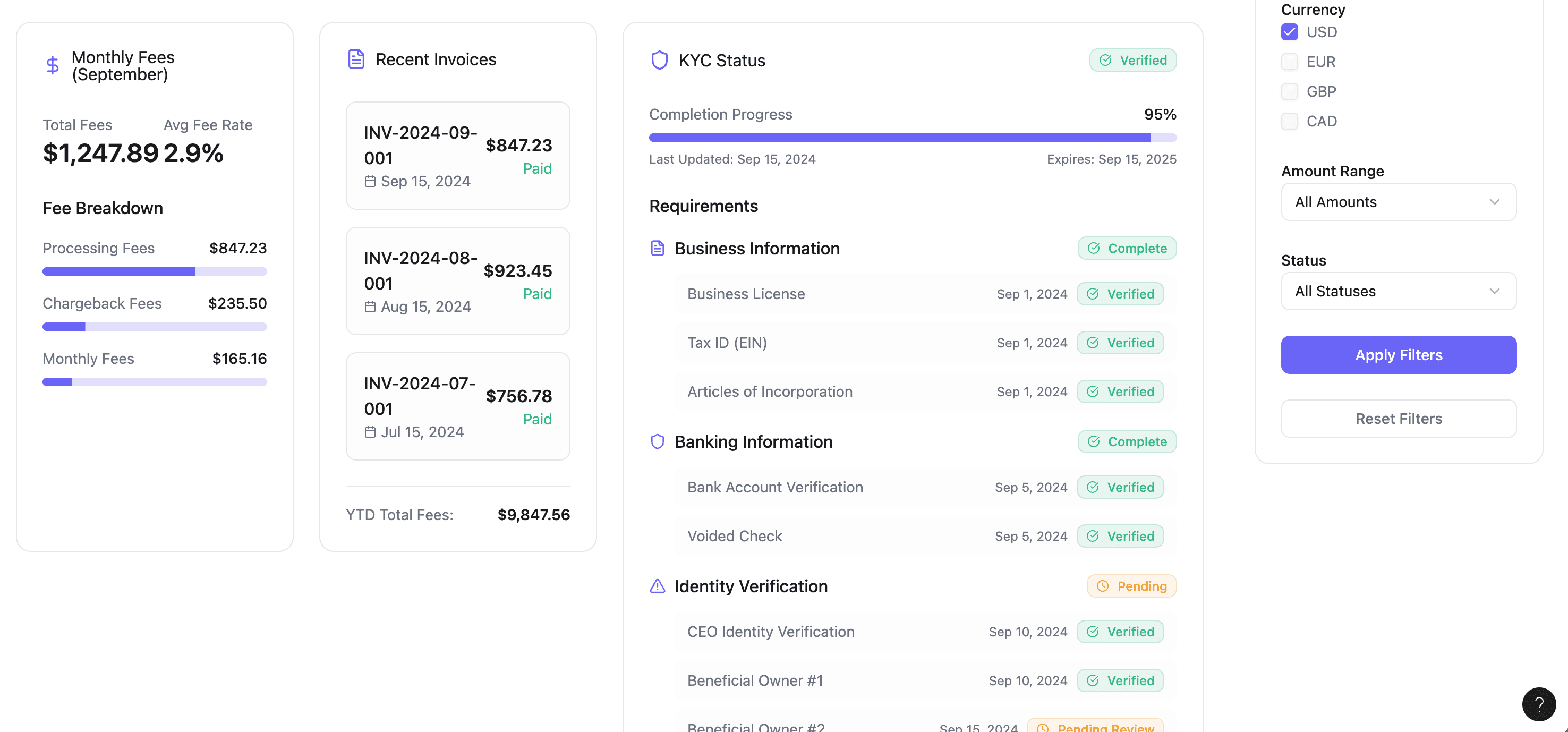
Work Example 2 : Partner / Merchant Dashboard
Designed for transaction tracking, settlement visibility, monitoring KYC status, and managing invoices with clarity and transparency.
High-fidelity wireframe :
Later, I redesigned into high-fidelity prototypes (2025) for portfolio purposes :
I upgraded low-fidelity wireframes into high-fidelity prototypes using Figma and UI component libraries, demonstrating clear information hierarchy and usability.
Design Rationale
Goals
Transform low-fidelity concepts into professional, visually consistent prototypes for portfolio presentation and usability testing.
Ensure the dashboards not only deliver functional clarity but also reflect a modern, trustworthy fintech interface suitable for compliance and financial teams.
Information Hierarchy
Retained the core structure from low-fidelity wireframes (balances, alerts, settlements) but enhanced with color coding, visual grouping, and spacing for faster comprehension.
Used modular cards for each information type (balances, alerts, modules, filters) to improve scanability and reduce cognitive load.
Design Enhancements
Introduced color-coded status indicators (green = operational, yellow = medium load, red = high priority) to help users quickly assess risk and performance.
Used UI component libraries (buttons, cards, tabs) to create consistency and make future scaling easier.
Added subtle visual cues like percentage changes and trend arrows to convey performance at a glance.
Interaction Choices
Global navigation placed as top tabs (Switch, Processing, Treasury, Compliance) for quick module switching.
Filters aligned on the right-hand panel for easy adjustment without cluttering the main workspace.
Compliance alerts styled with priority tags (High / Medium) so teams can triage efficiently.
Future Iterations
Explore data visualization such as trend charts, line graphs, or heatmaps to complement raw numbers.
Conduct user testing with compliance officers and merchants to refine usability and optimize workflows.
Example 1 : Internal Dashboard
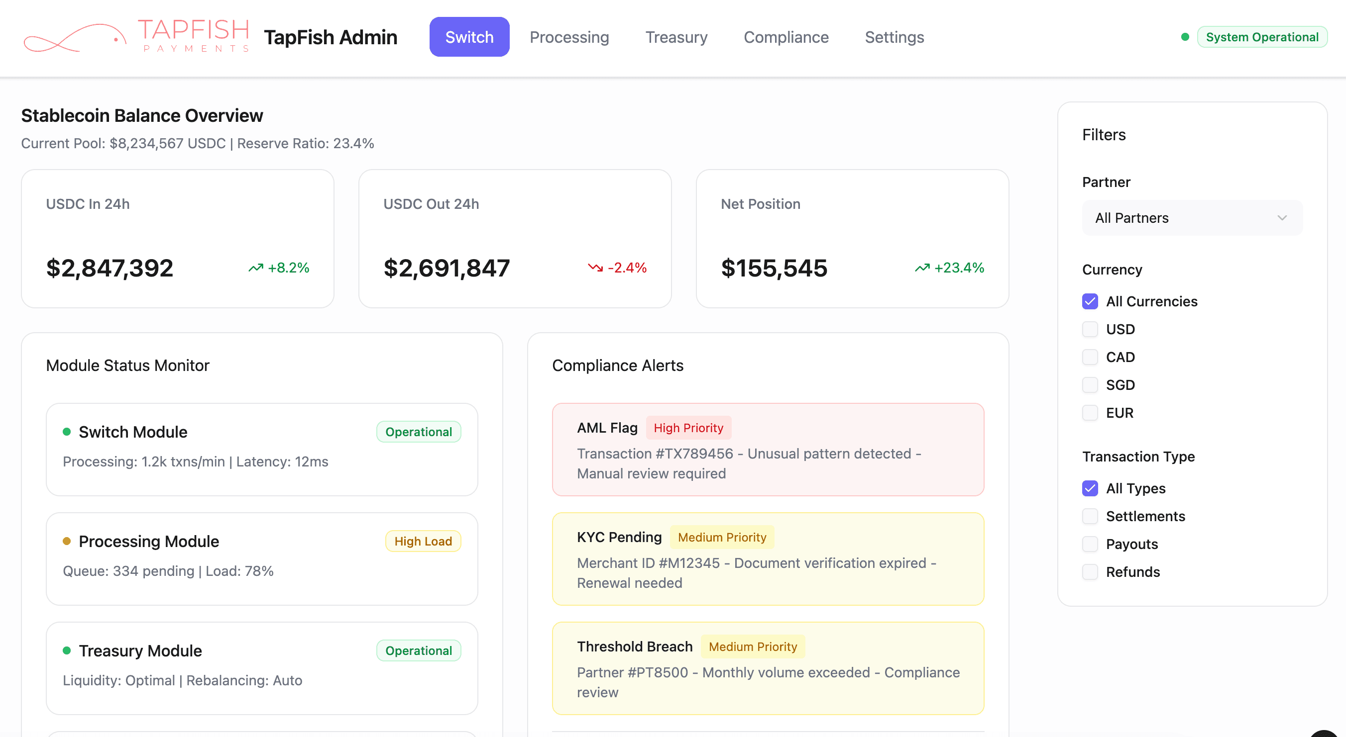
Example 2 : Internal Dashboard
Example 3 : Partner / Merchant Dashboard
Design Rationale
Goals
Provide merchants with a clear and transparent view of their transactions, settlements, fees, and compliance status.
Reduce friction in financial reconciliation and compliance processes by making all critical information accessible from a single portal.
Information Hierarchy
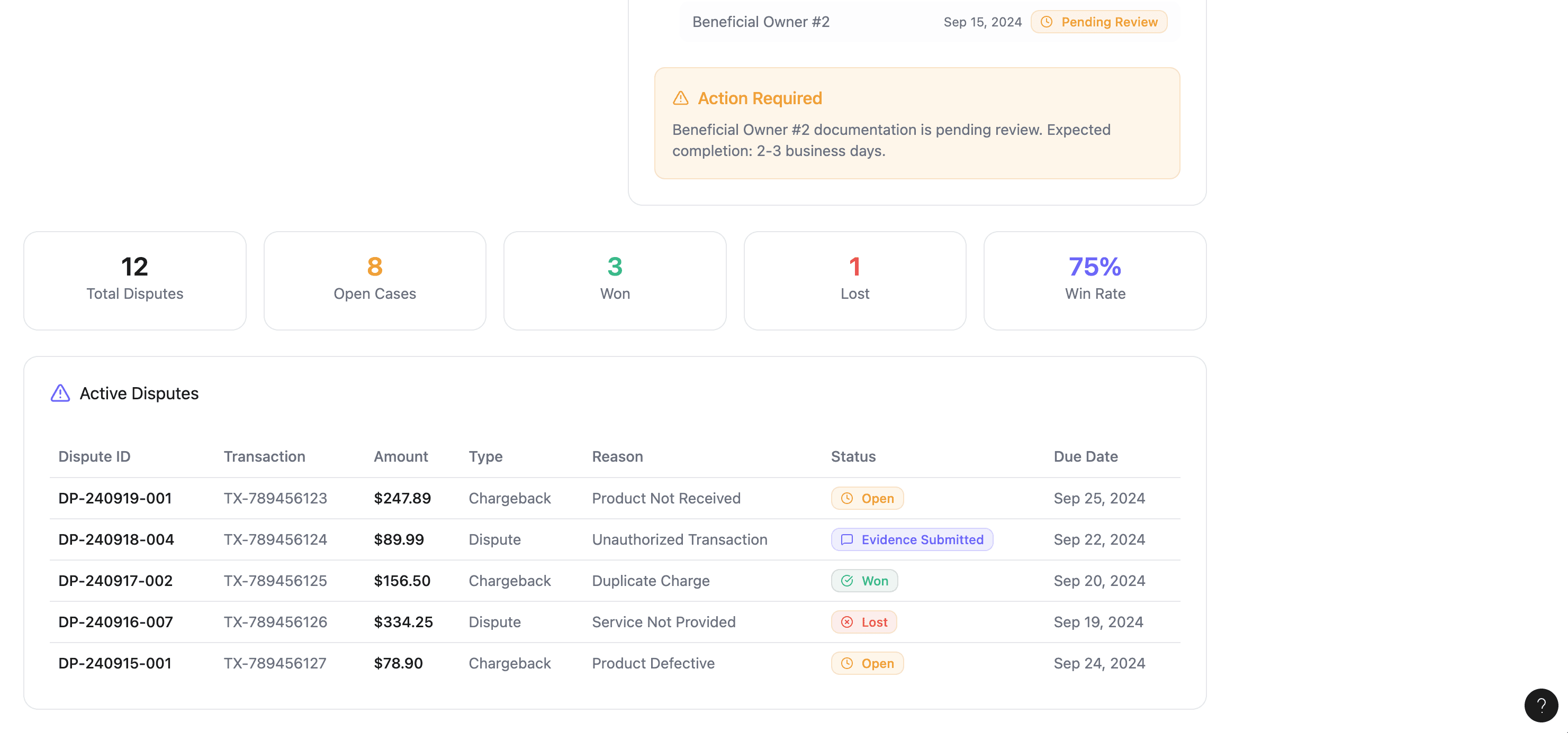
Example 3 (Transactions Dashboard): Focused on real-time processing activity with KPIs (volume, count, average ticket, success rate) displayed at the top for quick insights, while pending settlements are prioritized in the main table for operational clarity.
Example 4 (Invoices & KYC Dashboard): Grouped monthly fees, recent invoices, and compliance requirements into modular sections, helping merchants track finances and KYC progress side by side.
Design Enhancements
Introduced status labels and color coding (Processing, Pending, Hold, Completed) to make settlement stages instantly recognizable.
Designed invoices with download + paid indicators for accountability and transparency.
Integrated a KYC progress tracker with visual completion percentages to reduce uncertainty around verification.
Interaction Choices
Filter panel (date range, transaction type, payment method, currency, status) placed on the right for quick refinement of results without leaving the page.
Modular card layouts allowed merchants to drill into invoices or compliance items without overwhelming them with dense data.
Success/failure rate indicators and tooltips built in for additional context without clutter.
Future Iterations
Expand to include trend analysis (charts for transaction growth, fee breakdowns over time).
Add notifications for overdue invoices or expiring compliance requirements.
Provide export options (CSV/Excel) to integrate with merchants’ internal accounting systems.
Example 4 : Partner / Merchant Dashboard
Example 5 : Partner / Merchant Dashboard